library(babynamesIL)
library(tidyverse)
#> ── Attaching core tidyverse packages ──────────────────────── tidyverse 2.0.0 ──
#> ✔ dplyr 1.2.1 ✔ readr 2.2.0
#> ✔ forcats 1.0.1 ✔ stringr 1.6.0
#> ✔ ggplot2 4.0.2 ✔ tibble 3.3.1
#> ✔ lubridate 1.9.5 ✔ tidyr 1.3.2
#> ✔ purrr 1.2.1
#> ── Conflicts ────────────────────────────────────────── tidyverse_conflicts() ──
#> ✖ dplyr::filter() masks stats::filter()
#> ✖ dplyr::lag() masks stats::lag()
#> ℹ Use the conflicted package (<http://conflicted.r-lib.org/>) to force all conflicts to become errors
library(tgstat)
theme_set(theme_classic())Israeli baby names
This package contains Israeli baby names data from 1949-2024, covering four demographic sectors: Jewish, Muslim, Christian-Arab, and Druze.
Distribution of names
We will start by looking at the distribution total number of babies for each name:
babynamesIL_totals %>%
mutate(sector = factor(sector, levels = c("Jewish", "Muslim", "Christian-Arab", "Druze"))) %>%
ggplot(aes(x = total, color = sex)) +
ggsci::scale_color_aaas() +
geom_density() +
scale_x_log10() +
facet_grid(. ~ sector) +
theme(axis.text.x = element_text(angle = 90, hjust = 1))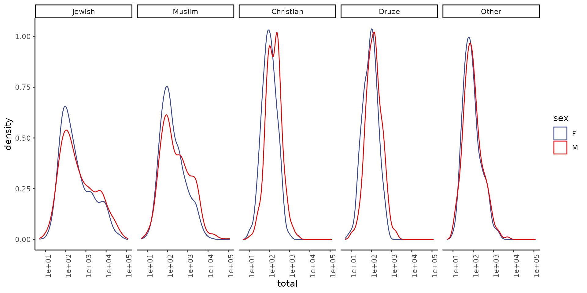
Note that the x axis is in log scale.
Top names
Top 20 names in each sex and sector:
babynamesIL_totals %>%
mutate(sector = factor(sector, levels = c("Jewish", "Muslim", "Christian-Arab", "Druze"))) %>%
group_by(sector, sex) %>%
slice_max(order_by = total, n = 20) %>%
arrange(sector, sex, desc(total)) %>%
mutate(name = forcats::fct_inorder(name)) %>%
ggplot(aes(x = name, y = total)) +
geom_col() +
facet_wrap(sector ~ sex, scales = "free", ncol = 2) +
ylab("total #") +
xlab("") +
theme(axis.text.x = element_text(angle = 90, hjust = 1))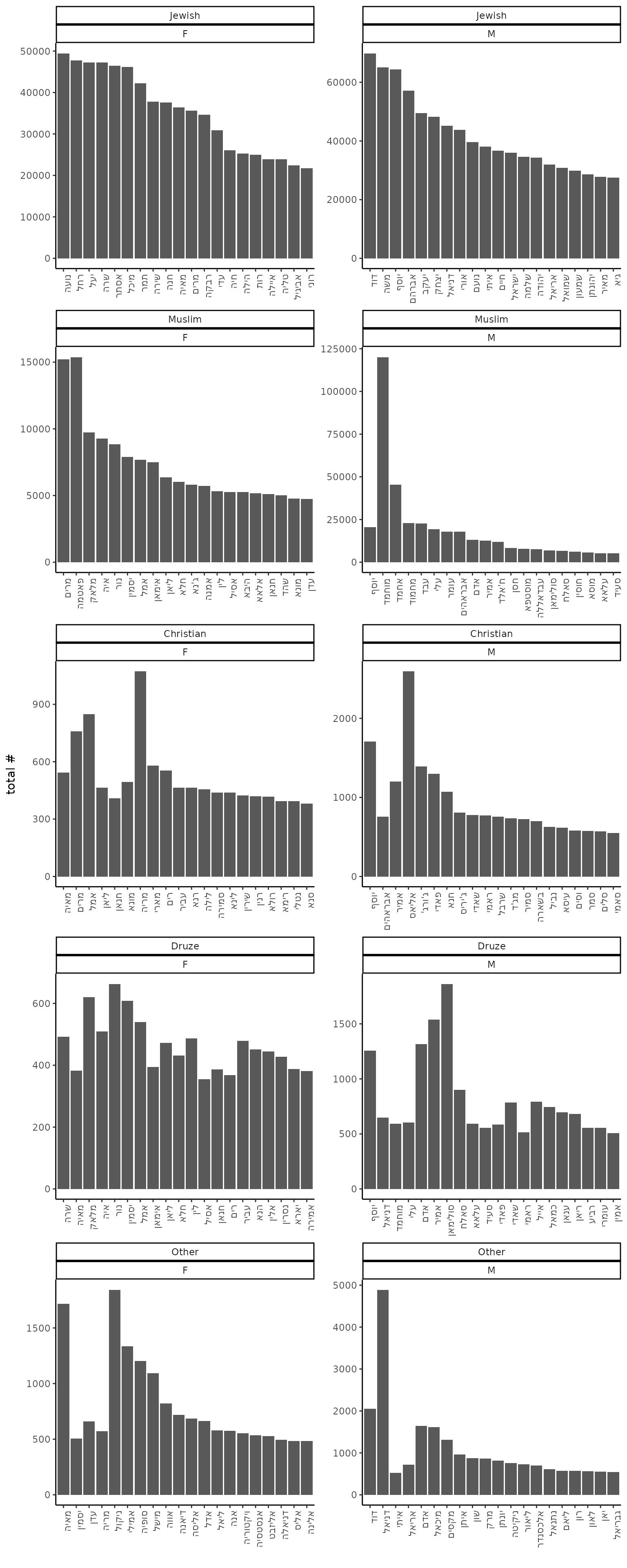
Names over time
a single name
babynamesIL %>%
tidyr::complete(sector, year, sex, name, fill = list(n = 0, prop = 0)) %>%
filter(name == "מעיין", sector == "Jewish") %>%
ggplot(aes(x = year, y = prop, color = sex)) +
geom_line() +
ggsci::scale_color_aaas() +
scale_y_continuous(labels = scales::percent) +
ggtitle("מעיין הבן מול מעיין הבת") +
theme_classic()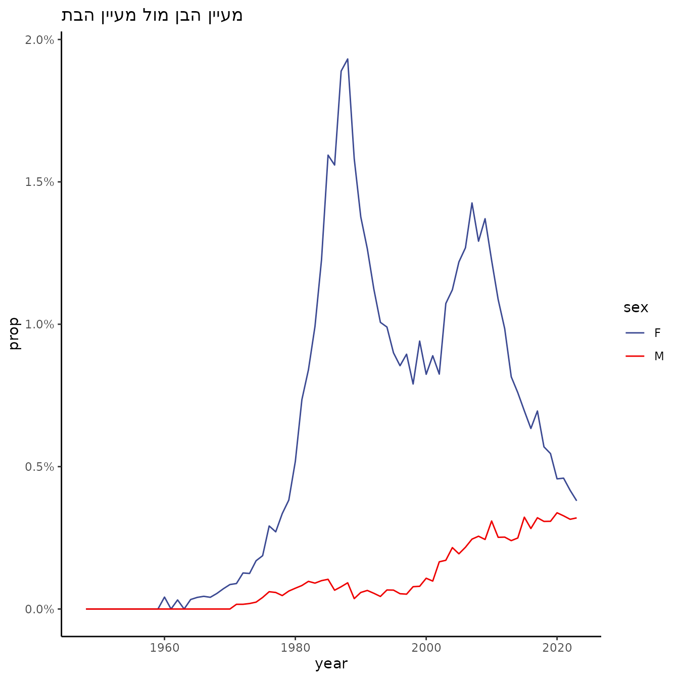
clustering
We will then create a matrix of the names and their frequencies over time. We will start with Jewish female babies.
names_mat <- babynamesIL %>%
filter(sector == "Jewish", sex == "F") %>%
select(year, name, prop) %>%
spread(year, prop, fill = 0) %>%
column_to_rownames("name") %>%
as.matrix()
dim(names_mat)
#> [1] 2302 76Normalize each name:
mat_norm <- names_mat / rowSums(names_mat)Select only names with at least 500 babies:
mat_norm_f <- mat_norm[babynamesIL_totals %>%
filter(sector == "Jewish", sex == "F") %>%
filter(total >= 500) %>%
pull(name), ]
dim(mat_norm_f)
#> [1] 668 76Cluster:
Reorder the clustering by year:
hc <- as.hclust(reorder(
as.dendrogram(hc),
apply(mat_norm_f, 1, which.max),
agglo.FUN = mean
))Plot the matrix:
text_mat <- babynamesIL %>%
filter(sector == "Jewish", sex == "F") %>%
tidyr::complete(sector, year, sex, name, fill = list(n = 0)) %>%
mutate(text = paste(name, paste0("year: ", year), paste0("n: ", n), sep = "\n")) %>%
select(year, name, text) %>%
spread(year, text) %>%
column_to_rownames("name") %>%
as.matrix()
plotly::plot_ly(z = mat_norm_f[hc$order, ], y = rownames(mat_norm_f)[hc$order], x = colnames(mat_norm_f), type = "heatmap", colors = colorRampPalette(c("white", "blue", "red", "yellow"))(1000), hoverinfo = "text", text = text_mat[hc$order, ]) %>%
plotly::layout(yaxis = list(title = ""), xaxis = list(title = "Year"))We will wrap it all in a function:
cluster_names <- function(sector, sex, min_total = 500, colors = colorRampPalette(c
("white", "blue", "red", "yellow"))(1000)) {
names_mat <- babynamesIL %>%
filter(sector == !!sector, sex == !!sex) %>%
select(year, name, prop) %>%
spread(year, prop, fill = 0) %>%
column_to_rownames("name") %>%
as.matrix()
text_mat <- babynamesIL %>%
filter(sector == !!sector, sex == !!sex) %>%
tidyr::complete(sector, year, sex, name, fill = list(n = 0)) %>%
mutate(text = paste(name, paste0("year: ", year), paste0("n: ", n), sep = "\n")) %>%
select(year, name, text) %>%
spread(year, text) %>%
column_to_rownames("name") %>%
as.matrix()
mat_norm <- names_mat / rowSums(names_mat)
top_names <- babynamesIL_totals %>%
filter(sector == !!sector, sex == !!sex) %>%
filter(total >= min_total) %>%
pull(name)
top_names <- intersect(top_names, rownames(mat_norm))
mat_norm_f <- mat_norm[top_names, ]
text_mat <- text_mat[rownames(mat_norm_f), colnames(mat_norm_f)]
hc <- tgs_cor(t(mat_norm_f)) %>%
tgs_dist() %>%
hclust(method = "ward.D2")
hc <- as.hclust(reorder(
as.dendrogram(hc),
apply(mat_norm_f, 1, which.max),
agglo.FUN = mean
))
plotly::plot_ly(z = mat_norm_f[hc$order, ], y = rownames(mat_norm_f)[hc$order], x = colnames(mat_norm_f), type = "heatmap", colors = colors, hoverinfo = "text", text = text_mat[hc$order, ]) %>%
plotly::layout(yaxis = list(title = ""), xaxis = list(title = "Year"))
}We can now plot also the Male names:
cluster_names("Jewish", "M")Or other sectors:
cluster_names("Muslim", "M")
cluster_names("Muslim", "F")
cluster_names("Christian-Arab", "M", 50)